Welcome
A brand identity is a vital element in communicating a company’s market differentiation and brand values. It is definitely the most visible element, and as such, should be treated with care and consistency.
This identity manual sets out fundamental rules and guides to help create and maintain a strong, recognizable and meaningful brand. Used properly, it will allow the brand to continually reinforce the company’s vision, mission and core values while attracting the target audience.
You want your brand to live in the hearts and minds of prospects and customers. Use this manual judiciously, and you’ll be well on your way to making that happen.
Brand Platform
The Albatross Wines Platform defines the essence of the organization and is meant to guide all activities and communications.
Vision
We will become the premier destination for wine enthusiasts seeking expertly curated selections, personalized service, and a seamless online experience, all delivered with the sophistication and care that elevates every occasion.
Mission
Albatross Wine is dedicated to taking the guesswork out of wine selection by offering personalized, curated collections, and exceptional service. We strive to connect our customers with wines that resonate with their tastes and enhance their experiences, all while delivering the convenience of online shopping with the expertise of a sommelier.
Core Values
Core values are the fundamental beliefs of a person or organization. These guiding principles dictate behavior and can help people understand the difference between right and wrong. Core values also help companies to determine if they are on the right path and fulfilling their goals by creating an unwavering guide.
Expertise: We bring the knowledge and passion of our sommelier to every bottle we recommend, ensuring our customers enjoy the finest wines that suit their preferences.
Personalization: We believe in the power of personalization, offering tailored wine selections that align with individual tastes and occasions.
Convenience: From online shopping to doorstep delivery, we make the wine-buying process simple and stress-free, without compromising on quality.
Community: We are committed to building a community of wine lovers who appreciate the art and experience of fine wine, fostering connections through shared passions.
Trust: We maintain the highest standards of quality and transparency in everything we do, from our wine recommendations and selection to our customer service.
Brand Identity
Logo
The logo is the visual representation of an organization and is the most important carrier of the identity. Therefore, it is critical to use the logo consistently and with consideration for the image it projects. The logo should be used to unify and
strengthen all internal and external communications.
The logo is distinct and its forms have been carefully considered. This is why they may not be altered in any way. Using the logo incorrectly undermines the brand and causes inconsistencies with your image. It is therefore very important that this manual be followed carefully.
Primary Logo Color Restrictions
Primary logo must always be represented reversed (white) on an approved brand color (or solid black) with high enough contrast for readability.
On select print materials, business card for example, special printing methods like gloss coating can be used to allow for the name to be in black. The feather must always appear in white.
When this isn’t possible the black logo variation (without the feather) can be used.
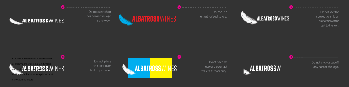
Unacceptable Usage
The logo should never be used in the following ways:
Support Element
The Albatross Wines‘s icon mark (The Feather) can be used separately from the logo on certain occasions as a design element.
When used on the same design piece as the black logo word mark the feather must be the height of the feather away from the logo word mark at all times.

Clear Space Requirements
Clear space gives the eye a place to rest and also helps direct the eye to what we want to be seen.
A minimum amount of clear space must be maintained around the logo at all times to ensure its visibility and protect its integrity. The clear space differentiates the logo from all other elements on a page including all text, graphics, photographs and the edge of a page, which must be kept outside the clear space.
A simple rule for determining the appropriate amount of clear space is the Height of the A. The Height of A Rule is based on the height of the A letter in the logo. Simply measure the height of the A to determine the minimum amount of clear space that should surround the logo.
The Height of A Rule is applicable for a logo of any size. Additionally, the clear space may be greater than the height of the S, but never less.
When the feather is used separately, the Height Half of The Feather Rule applies. Measure the height of the “Feather” and divide by 2 to determine the minimum amount of clear space that should surround the feather.
When the feather is used near the logo it must always be presented one full feather height away from the logo.

Color Palette
The palette represents the spectrum of acceptable brand identity colors and should be used for all types of media. The primary palette represents the colors that should be used the most and the secondary palette represents the colors that should be used as accents. No other colors should ever be used.
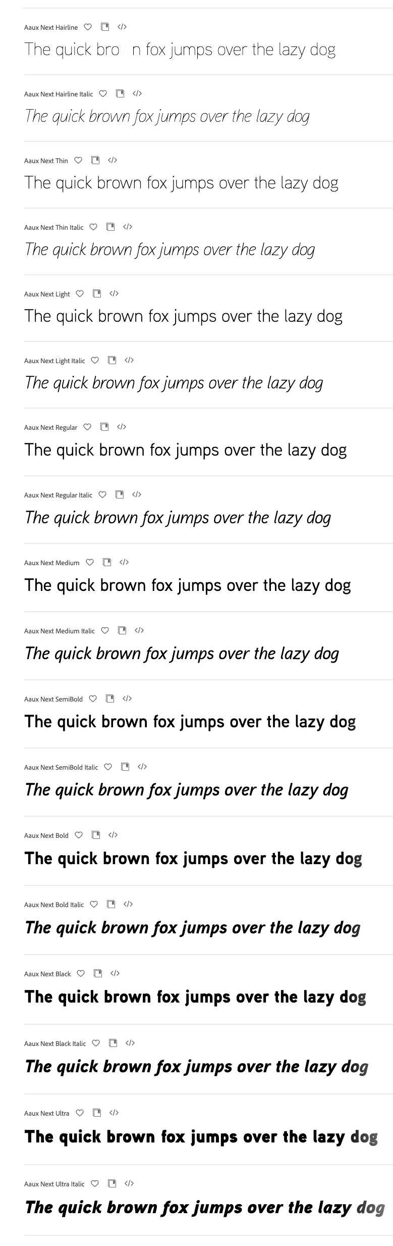
Typography
The typeface selected for Albatross Wines helps create a consistent and recognizable brand presence in all communications. Aaux Next should be used on all internal and external applications including all printed communications, digital presentations, signage, promotions and merchandise.
For website and email applications in which Aaux Next is not available, it may be substituted with Helvetica or Arial.
In most cases, the variations in the Aaux Next family of typefaces offers a lot of flexibility. However, using more than two or three variations in one document is not recommended. For the best results, follow these simple rules:
- For running text use Aaux Next Regular.
- For bold text use Aaux Next Bold or Black.
- For captions use Aaux Next Italic or Light Italic.
Brand Assets
Email Signatures
An email signature template has been created to ensure brand consistency and quality of electronic communications.
All employees should use their signature in all email communications.

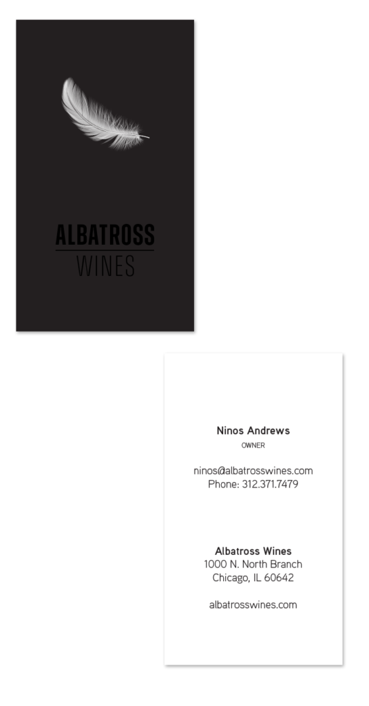
Business Cards
Business cards often provide a first impression as well as a lasting impression. The front and back layouts of the business card must be followed consistently. The size of the business cards is 2 x 3.5”.
Request Business Cards
Letterhead
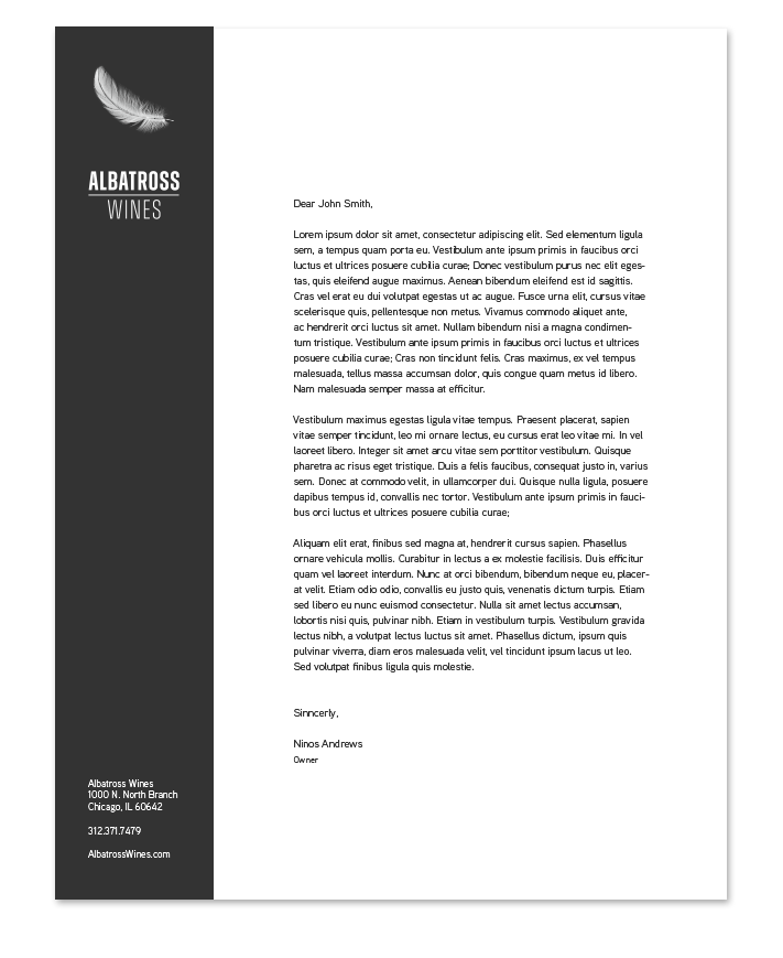
Letterhead is a projection of brand image and brand identity in written communications. The layout, typeface and logo usage for the letterhead should be followed exactly.
Letterhead should be printed by a professional printer and only be used for the first page. Successive pages should be on plain white paper.
Files
A variety of file formats for the material covered here are provided. This is a quick list of what each file format means, and where they would best be used.
Brand Identity Graphics
.ai format is the “raw” format and will likely never be used internally.
.eps format is a standard logo format and is ideal for printers and other professional uses.
.jpg format is lower quality but will work well for internal use with Microsoft office software.
.png format is similar to .jpg except it has a transparent background and not all applications recognize it. This format is ideal when placing the logo on top of color.
Brand Asset Graphics
.idml and .indd formats are the “raw” format and will most likely be used by a printer or designer.
.pdf format is used to present documents in a manner independent of application software, hardware and operating systems. It is not editable.